We talk to colour expert Laura Perryman about Milliken’s new Tracing Landscapes collection.
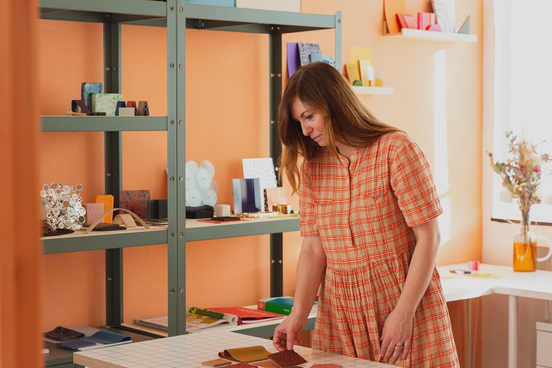
Laura is a colour designer and forecaster with over 18 years of experience in CMF design across multiple industries. The author of The Colour Bible, Laura is interested in material and sensorial experiences of colour. And, like Milliken, she connects colour holistically with ethics, sustainability and wellbeing. We got together to talk about the role of colour in our new Tracing Landscapes collection.
All photography by Sara Hibbert
Tracing Landscapes
GIVEN YOUR BROAD EXPERIENCE OF COLOUR, WHAT STAND OUT FOR YOU IN THE COLLECTION?
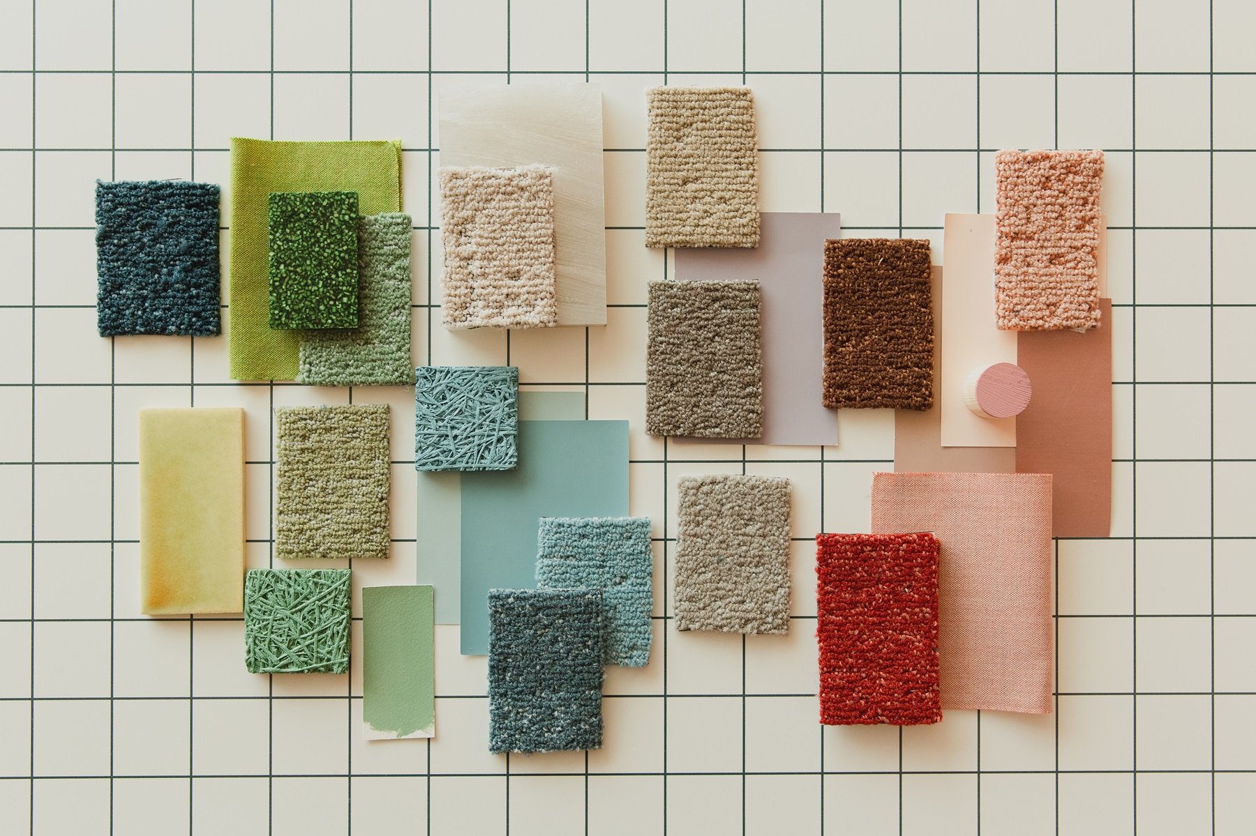
The names behind the colours relate to British landscapes, which have powerful emotional and memory associations. These, as well as the new broad range of colours, really stood out to me. Language is one aspect that is key for colour communications, and some of my favourite shades in this collection also have evocative names. There’s a beautiful pastel coral named Wild Orchard, a soft light green called Open Glade, and Brisk Walk, an easy-to-use heart-warming neutral.
HOW DO YOU FEEL TRACING LANDSCAPES COMPARES TO EARLIER COLLECTIONS ON COLOUR?
This collection is a real colour evolution. It expands on ‘Tracing Landscapes’ with some really fresh new colour areas. There is a sense of a colour symphony that connects references from nature with nature’s ability to create stunning connections with colour. It feels apt as we move into the Spring season that these new colours represent fresh skies, a connection to the earth and the mood-enhancing viewpoints of natural landscapes.
HOW WOULD YOU DESCRIBE THE AESTHETIC OF THE NEW COLLECTION?
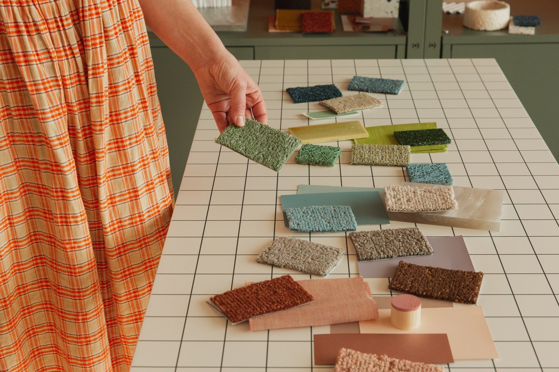
Milliken does colour very well, and the balance and choice in this range open up opportunities to create a variety of palettes or moods. Sometimes you need a darker colour alongside a lighter one to truly see its success and value. Swatches need to be held and put next to other references too, to provide context for introducing colour to a space.
The broadness of greens and blues and the exploration of warm neutrals - in addition to more ‘powerful neutrals’ - offer contrast and the ability to soften spaces and create neutral environments. This can be very powerful in supporting neurodiversity and creating comfortable, supportive office spaces.
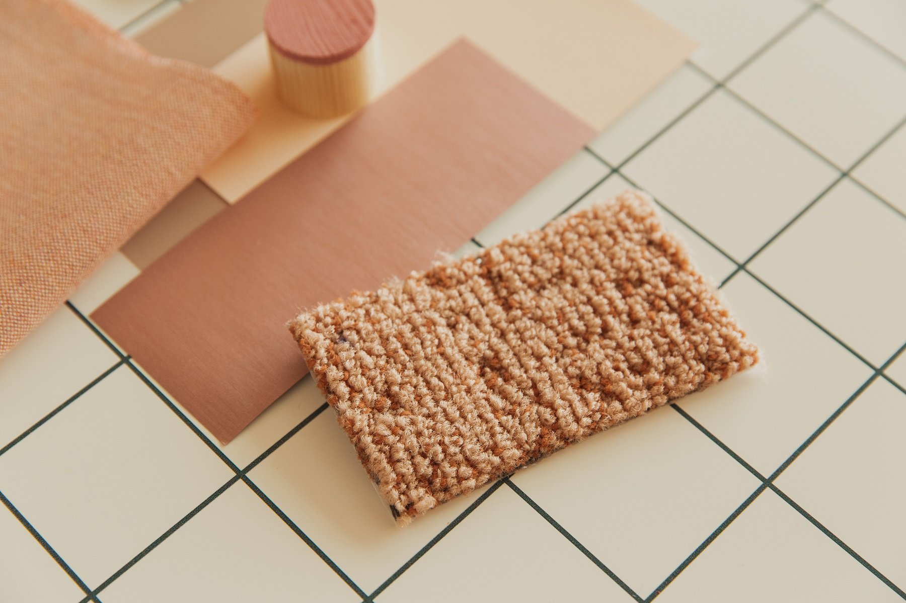
Flecked and irregular textures are a key characteristic of this collection’s aesthetic. These echo the natural inspiration of the range, as well as providing visual softness that supports the touch of the yarn. There’s an artisanal quality, especially in the soft oranges and reds of Footbridge, Rocky Ground and Viewpoint, that speaks to a growing trend for softer, more tactile interiors.
Tracing Landscapes - Wild Orchard
How do the colours in Tracing Landscapes link to current topics and trends?
At the moment, we’re asking: If the future of workspaces is remote, what are our changing needs? With the changing nature of work, how can colour, via collections like Tracing Landscapes, transform the future use of office spaces, flexible spaces, home offices, and offices that feel like home? This is important for the future of work, especially with the growth of more flexible working patterns.
There’s a relaxed feel to the colour areas in this collection that we’re also noticing in office trends. Formal offices have been replaced with communal shared spaces with different needs and functions, such as break-out lounges, quiet areas and places to socialise. The whole approach to office has been relaxed.
Pantone’s Colour of the Year 2024, Peach Fuzz, has focused attention on coral and peach. These colours are actually quite balanced in tone and are emerging almost as a new neutral. Wild Orchard is perhaps closest in tone, and natural pastels are an important colour area in Tracing Landscapes that speak to this trend.
We’ve also seen a strong movement to more sustainable and natural material palettes in trends, from living green walls to plant-based textiles and furnishings. The new colour collection emulates these themes with textured qualities and natural colour levels. And it shows office spaces are really softening.
WHERE COULD THE NEW COLOURS BE USED?
The soft and grounding qualities of this collection will suit smaller spaces. They’re also ideal for co-work spaces with break-out lounges, where durability is still key, but so is a relaxed ‘home-style’ interiors feel.
Pinky corals and reds like Dusky Evening and Hidden Path will make spaces feel warmer and more nurturing. Lighter greens, Curious Forest and Open Glade will lift environments and user moods.
LAURA'S COLOUR HIGHLIGHTS AND RECOMMENDATIONS
1. Coral reds, soft oranges and warm browns. These are wild and interesting rather than drab, which can be the case. Warm Mittens is a highlight for me. It has a warm feel with a soft caramel fleck.
2. ‘Natural pastels’. The palest tones across all the colour groups in this collection are really soft and supportive. A favourite of mine is Curious Forest.
3. ‘Powerful neutrals’. Warm, natural neutrals are vital for setting a truly neutral tone and space, which is important for establishing contrast and focus. Try Brisk Walk for a supportive base colour.
4. Greens. A must colour group for interiors, especially those harnessing and responding to biophilia, the greens in this collection are evolved and nuanced. Lighter levels of green are key to trends, such as Open Glade.
5. ‘Diverse’ blues. From cool to warm, blues create soft and serene backdrops and base tones for working spaces. Clear Day is a clear favourite.
Laura Perryman MA (RCA)
Laura is CMF consultant, author and colour trend forecaster with over 15 years' experience. Her first book, The Colour Bible (Octopus Books, 2021) highlights 100 significant colours in art and design and is published in 7 languages. Her ethos is that colour and materials should be integral to design but above all have a positive purpose for applications, products, and services. Working with brands, she helps create emotionally-connected and sustainable palettes in tech, interiors, packaging and product design. Laura currently directs Colour of Saying, a consultancy that specialises in future-forward design with colour and materials.
https://lauraperryman.co/
https://www.instagram.com/colour_of_saying/
https://www.instagram.com/lauraemilyp/


