Reading Time : 4 mins
It could be said that we explore colour throughout our daily lives. Living with and through colour affects all that we are as individuals.
Our personalities, our mood, our thoughts, what we eat, how we feel, our choices and sometimes our desires. Colour creates memories, ideas, perceptions, it plays with light, pattern, shape and form.
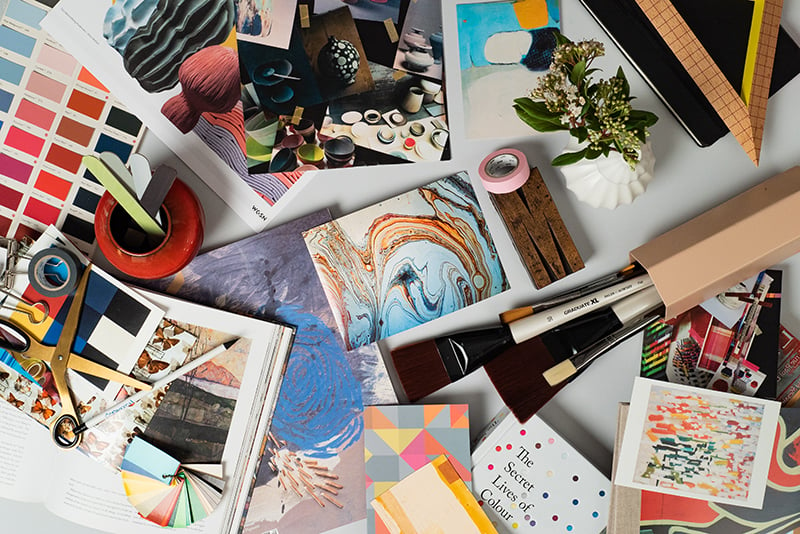
The in-house design team seek colour inspiration from all that surrounds us. Our interests, travel, research, trend forecasting and generally being a part of a truly global design team are the platform to where our colour story starts. Our colour choices will always evolve and change, a palette can have an historical context, with some colours continuing to have a place in time and some that may only exist for a short season.
Exploring colour alongside pattern, scale and texture.
For the last 3 years I have been lucky enough to sit upon the Colour Hive bi-annual forecast industry panel. Bringing industry experts together to share their thoughts of future trends for the global market. To be published in MIX Magazine. Within the panel we discuss colour, design and all its applications. This has given me an additional insight in to colour and to be able to talk with authority about how we create our own palettes here at Milliken carpet.
We relate tone and shade to nature, art, history, science, traditions, heritage, global geography & the contemporary way in which we live.
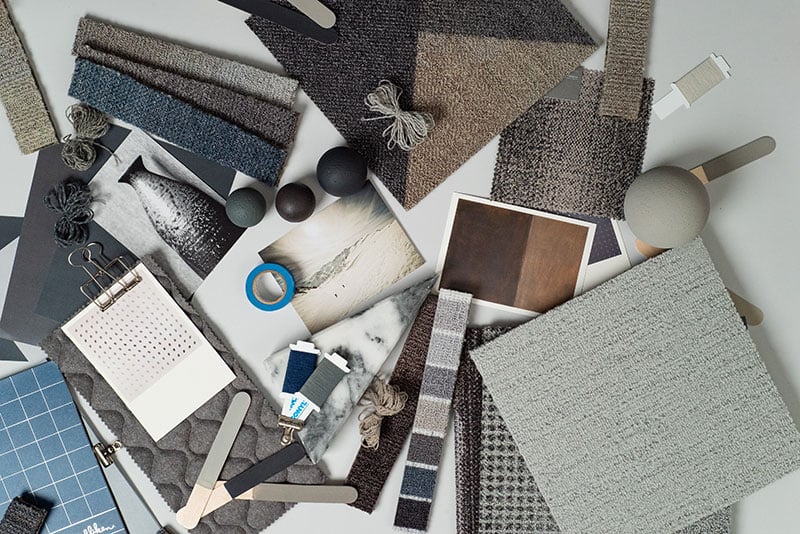
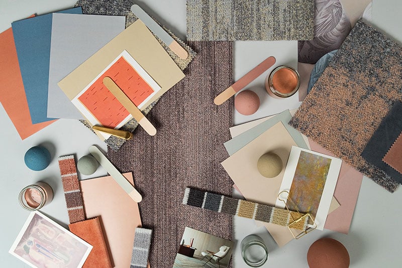
An ethereal palette of greys, blues and neutrals.
Collecting all our individual inspirations, we work together to create our colour stories. Different interests, creative direction, industry experience, and strong personal opinions all make for innovative colour discussion. Regular colour workshops give the team opportunity to get creative and propose new colour choices. With detailed references and consideration, we select our new colour additions. All proposed with a genuine reason and story. It’s a colourful process.
When creating our Milliken colour palettes there will be some colours that are a must. They are the Greys, Blues and the Neutrals. This is sometimes historic as they form a base for other colours to shine, you could call them the staples. We see them as the foundations to our palette. Functional, but not boring, unobtrusive and hard working. We try to vary their characteristics as we evolve our Milliken colour palette.
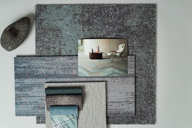
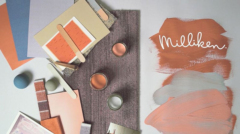
Milliken Collections featuring Comfortable Concrete, Colour Compositions and Clerkenwell.
With inspiration coming from how they may be used, their surroundings and the spaces they entertain. It could be that one year they become warmer, friendlier, more considerate of light, or they could be influenced strongly by an ongoing social trend. They may be targeting a specific market place or interior space.
The tones are a core of colours that sit above the staples, they are rich in depth and pigment. Layer upon layer we apply the colour with the tonal earthiness that really does reflect nature. Burgundy, Moss green, Cornflower, Chestnut, Olive, Teal, Shrimp & Grape give us mid tones that evoke a sense of wellness and rest. In touch with the earth, our feet grounded in the here and now. So, the palette is slowly growing with each colour addition.
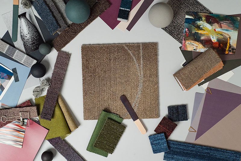
Mid tones that evoke a sense of wellness and rest.
Then into the mix we then add some statement colour. Besides the foundations and tones we place the expressions of colour. Bright, opinionated, fashion following, they are strong personalities. Shocking pink, brash and a glorious vice. Absinthe Green dosed in acidity. Dutch Orange celebrated with a smile. Mauve & Magenta, Vermillion & Scarlet all providing a snippet of something more daring. Pared with a Charcoal acidic green calms. Placing mauve next to whitewash grey becomes precious and classic. Navy and pink become a comfortable paring. Unexpected marriages of colour are a must, it’s exciting and gives the palette a contemporary edge.
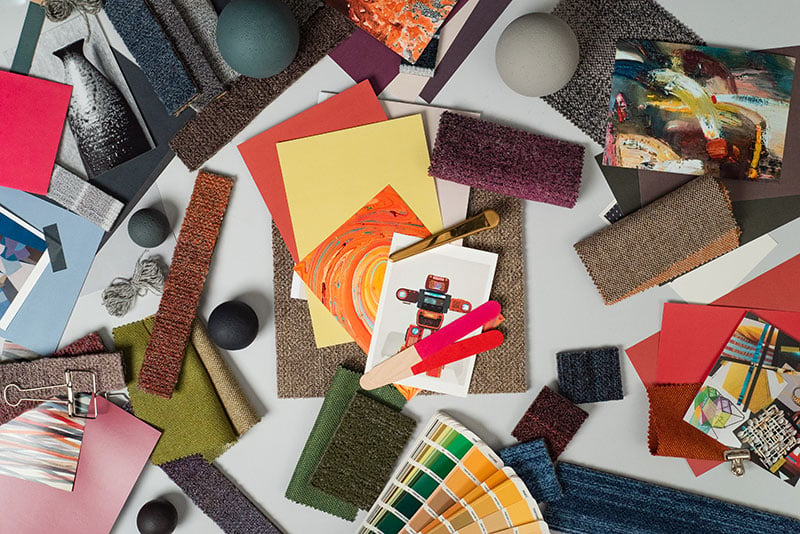
An exciting and contemporary palette.
To be able to introduce new colour hues to our existing colour palette is both exciting and challenging. We need to be mindful of function and having a commercial head, yet at the same time it’s important to introduce new approaches and not fear something different.
I love the fact that a colour can cause an opinion, it might be subjective or push boundaries within our industry. But I feel it’s necessary to inspire, to keep moving and not be predictable with colour. The unexpected can be inspiring.
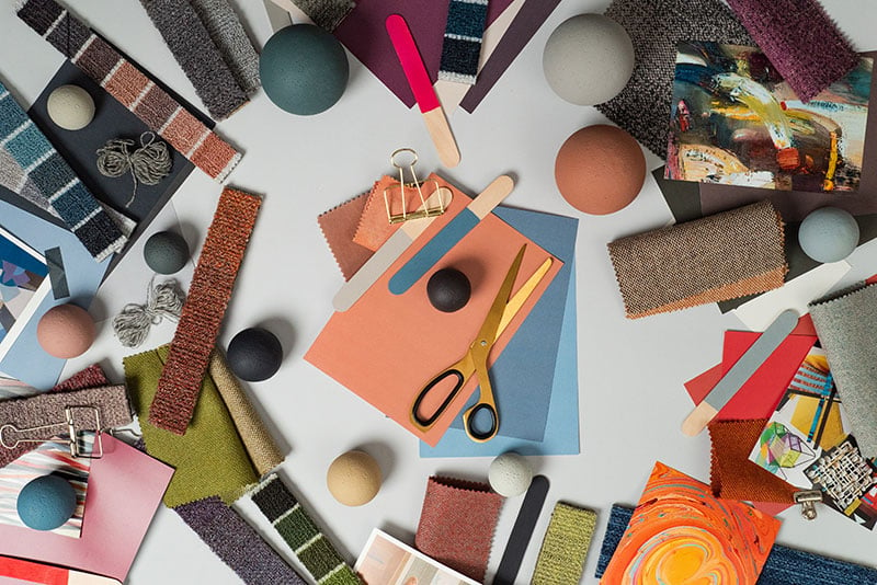
Old and new colours combine.
After lots of research, colour proposals and palette refinement we have our next set of new additions. Our recent new colour additions are a step away from some traditional colour combinations, especially within the flooring industry. They have all been chosen to complement our existing colour spectrum. Blended greys, smudged rose, dusted pigments of blue, smoky ochres all connect to create a layered softened industrial palette.
I feel that creating different nuances within our colour palette has refined our overall colour space, their addition inspires detail and considered placement. Carefully chosen to give a new inspiring direction to designing with colour and the forthcoming Milliken collections.
Milliken Collections featuring Colour Compositions and Comfortable Concrete.
Milliken’s colour palette & design collections are always evolving. New colours will be added. The palette will develop and be mindful of trends and market place requirements. The design team’s passions will be projected into the colour story, which will produce new and exciting concepts. We will always need to expand our view on colour. Create new colour meanings and apply then to our textile medium of carpet.
We consider this to be an exciting creative process, we are looking forward to introducing our next generation of colour to you within our future collections here at Milliken.